How you can incorporate the color into your wedding
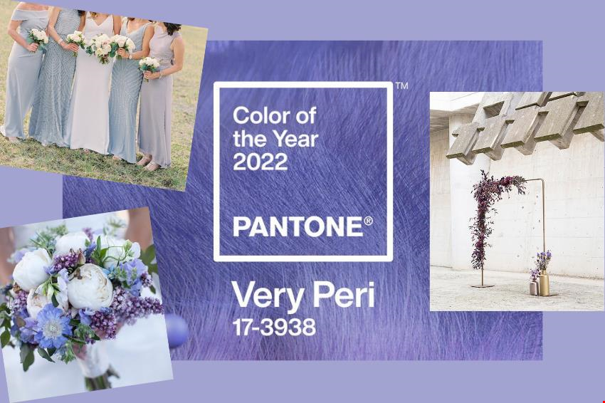
This week Pantone released 2022’s color of the year which had many creatives excited. Very Peri, a blue with violet and red undertones, is said to “display a spritely, joyous attitude and dynamic presence that encourages courageous creativity and imaginative expression.” Leatric Eiseman, Executive Director of the Pantone Color Institute said “As we move into a world of unprecedented change, the selection of PANTONE 17-3938 Very Peri brings a novel perspective and vision of the trusted and beloved blue color family, encompassing the qualities of the blues.”
RELATED: Mao and Ria – Classic City Wedding
If you’re feeling inspired by Very Peri like we are, here are some ways you can incorporate Pantone’s 2022 color of the year into your wedding details!
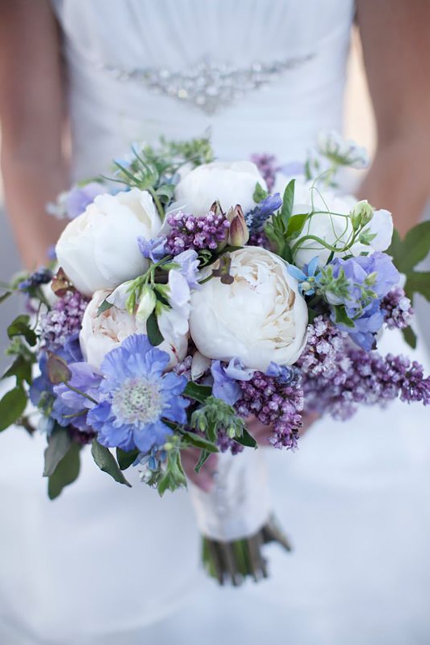
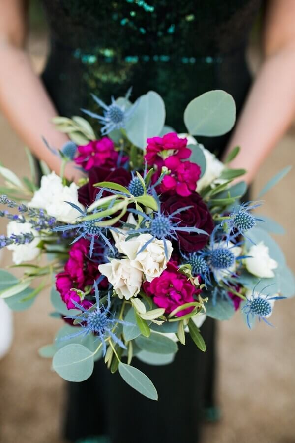
1. Floral arrangement and styling
Such a beautiful and lively color is easy to work into your event styling and bouquets. For summer weddings, think of bright colors to complement it like yellows, pinks, and greens. For more dramatic color combinations, you can look to plums, wine, and sage. Yes, it can even work with more minimalist design aesthetic if you want Very Peri to be your pop of color for arrangements. The options are quite endless, just ask your event stylist or florist and scroll down to see some arrangement ideas.
RELATED: Thien and Alexandra – Sophisticated in All White
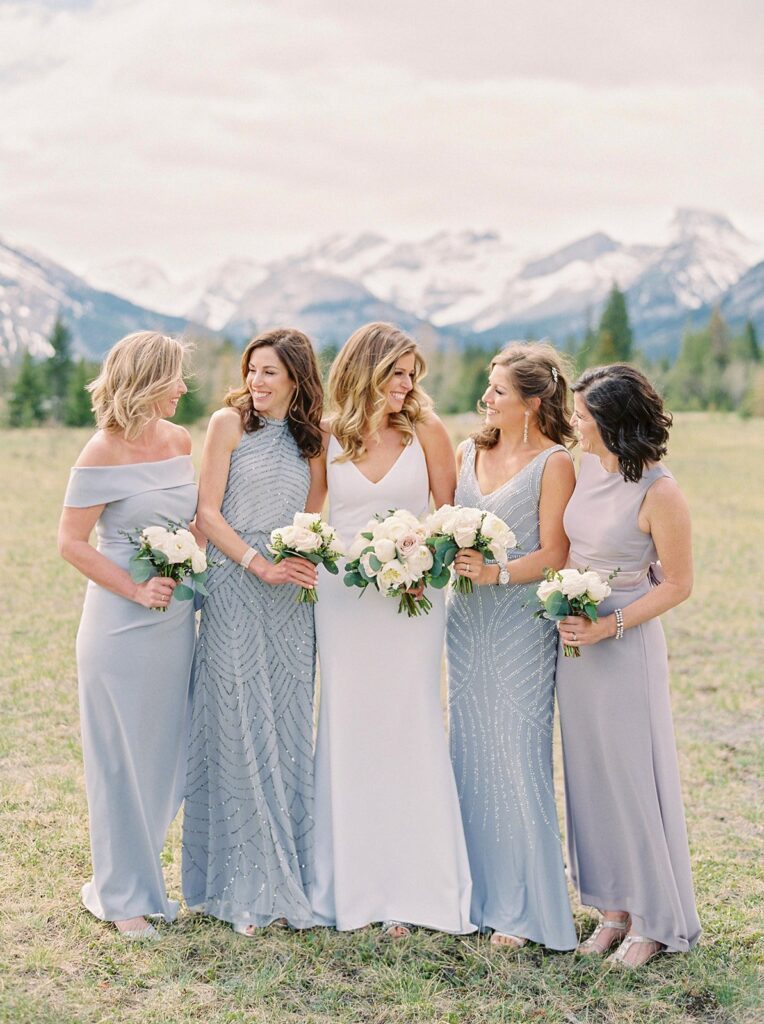
2. Bridesmaid colors
Love Very Peri and want it to dominate your wedding theme and motif? Have your bridesmaids and groomsmen wear the color! You can mix it with dusty blue and light gray for a gradient of colors or simply wear as is. Light colored suits for groomsmen would also complement this joyous shade well.

3. Ceremony arc
Too much color isn’t your style? Very Peri can also work with modern styles. Just see the ceremony arc we feature below. It can be the focal point of your ceremony that can double up as a photo area for your guests once the ceremony is done. Less can indeed be more even with such a spritely shade. Mixing it with gold gives the color a bit of warmth.

RELATED: Den and Ems – Dainty Tarlac Civil Wedding
4. Invitation art and overall branding
These days we see couples creating brand kits of sorts for their weddings where the style guide includes everything visual. Working Very Peri into your invitation art, wedding website and online communications, thank you notes, etc. is another way to thoughtfully use the color of the year for your wedding. Work with a friend who’s inclined to design and the arts to help you find color combinations and fonts that represent you and your fiancé. Another is to look around the web, such as this website that helps create color combinations.

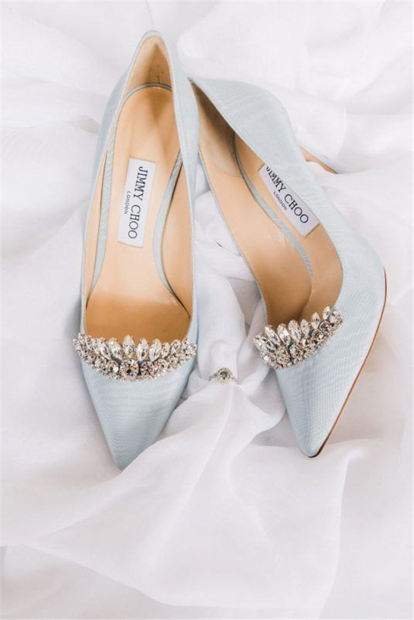
5. Something blue
Pantone calls Very Peri a shade of blue, though many online identify it to be similar to purple. You could choose Very Peri to be your “something blue” for your wedding ensemble. Many brides love to wear a pair of blue shoes to follow this tradition, and it looks like we’ll be seeing more Very Peri bridal shoes very soon!
Which of these five ideas would you do for your wedding? Share this story now!
Photos from Amaze Paperie, Wedding Connexion, Wedding Forward, Elegant Wedding Invites, wedding-venues.co.uk, Justine Milton Photography, Ruffled Blog, and Pantone.